
Acqua Della Dea
Branding & Packaging
Tools: Illustrator | Photoshop
Acqua Della Dea is an Italian luxury perfume company that strives to create unique scents that tell stories, evoke emotions, and provide a sensory escape to different corners of the world.
The goal of this fictional brief was to create a unique logo that conveys the brand’s roots, along with designing packaging that will stand out on shelves and provoke a consumer’s interest.

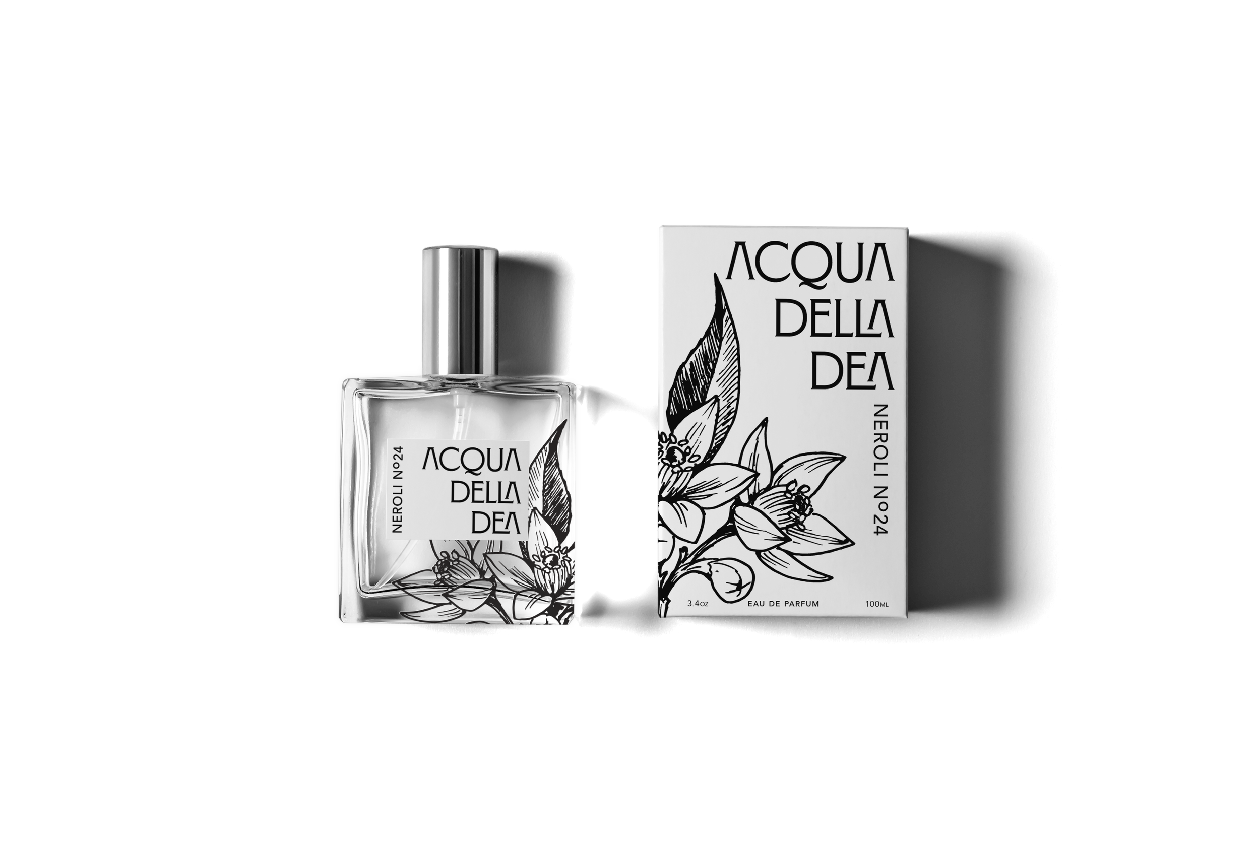
For the logo, I wanted to highlight the brand’s Italian roots, to do so I opted for a serif font that has a Romanesque quality to it (Montecatini Pro). One unique feature of the name is that all three words end in “A” which inspired the stacking of the “A’s” via right aligning the text. For added interest removed the crossbars of the “A’s” and used alternate glyphs to nest the “L” and “A” in “della,” while doing the same with the “E” and “A” in “dea.”
LOGO
The packaging design was a play on contrasts. Large logo (ft serif typeface) in the upper third of the box vs. smaller vertical sans-serif typeface (Avenir) text used for the fragrance's name. Black and white front/ back vs. vibrant high saturated colors on the sides + top and bottom of the box. Hand-drawn slightly vintage line illustrations of the scent’s key ingredient/theme vs. bright modern colors.
These colors were chosen to correspond to each scent. For example, in the signature scents collection, the “Amalfi Del Mar” scent is inspired by the Amalfi coast and heavily features lemon and lemon blossom; the sides are bright lemon yellow. As for the limited-edition city-inspired collection, London has the red of double-decker buses and phone booths. Porto has a bright royal blue inspired by the blue and white Portuguese tile that covers the city. NYC Nights is black to tie into the night theme, and black is a very New York color.
Process

For the bottle design, each bottle has a white rectangular label that predominately features the logo, and running vertically on the left-hand side is the name of the fragrance. Then printed on the bottle itself is the same black line illustration from the box.


![Dieline AdobeStock_521769391 [Converted]-01.png](https://images.squarespace-cdn.com/content/v1/64473c3788d0b9050c2f15d4/9548f2fc-3a62-4005-9678-80a4a4759590/Dieline+AdobeStock_521769391+%5BConverted%5D-01.png)