Essie Nail Polish
Realistic Illustration
Tools: Illustrator | Photoshop
Student project to create a photo-realistic product rendering of a bottle of Essie’s nail polish which could then be easily recolored and used across Essie’s footprint from billboards to social media ads.
Essie started in 1981 and has since grown to one the most famous and well-loved nail polish brands. It’s known for its wide range of shades and being on trend, if not driving trends, season after season. It’s salon-quality formula and whimsical names such as “Rose to the Occasion,” and “Revenge’s A Beach” have earned it a loyal following.
Process

Original Product Image

Skeleton Drawing

Illustration
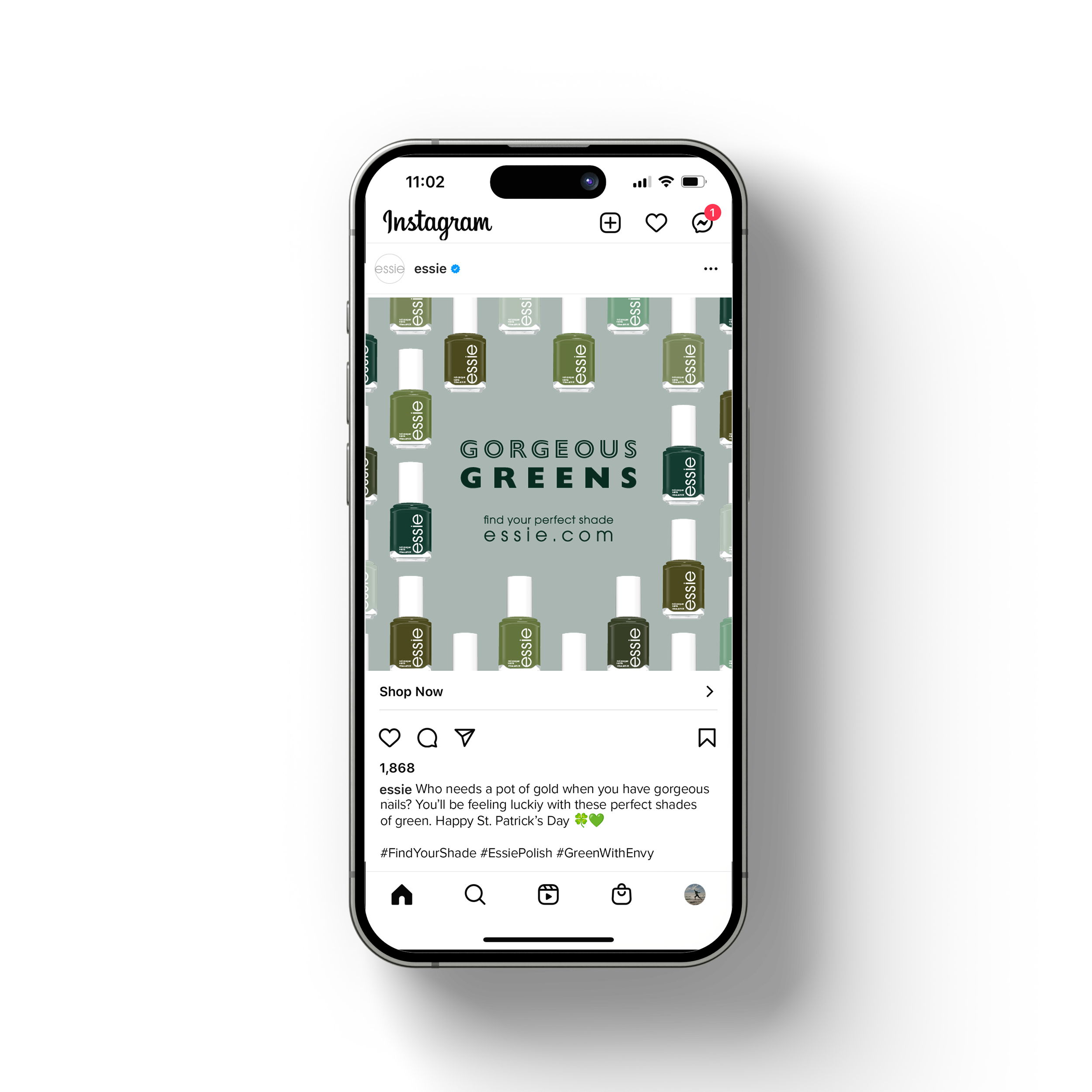
Using Illustrator created a photo-realistic rendering of a bottle of Essie’s nail polish via shapes, gradients, patterns, and more. The goal was to create a product illustration that was scalable and easily recolored so could convey the wide variety of shades that Essie offers.
For the ad campaign using the product illustration, I wanted to highlight just how many shades Essie has available. I noticed on their website that the breakdown their colors into the following categories: whites, nudes, pinks, corals, reds, purples, blues, greens, yellows, grays, and metallics & glitters. With these categories as a jumping off point I selected an adjective to describe each color category: Opulent Oranges, Bold Blues, Radiant Reds, Captivating Corals, Gorgeous Greens, etc. Once the adjective was selected I used expressive typography that matched that adjective and color’s personality for the ad. For “Bold Blues” used an extra bold sans-serif typeface, for “Opulent Oranges” used a script with extra ligatures. Each ad then features a showcase of the product illustration recolored to match some of the most popular shades in that category.